According to research, the global outdoor advertising industry will grow by 8.26 billion between the years 2019-2023; a large part of this is constituted by outdoor banners. If you are not investing in the outdoor banner market, you are missing out on a valuable opportunity to advertise your business.
A Banner Decision
Designing the right type of custom banner is just as important as the decision to invest in them. If your banner is not designed properly, you will not be able to capture the attention of your audience which will ultimately affect your ROI.
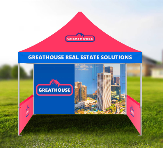
The ideal banner should provide your location, contact information, and any special events or discounts your company is hosting or offering. There are tips you can use to create an attractive outdoor banner that will help you grab the attention of your audience, and all help you get the desired outcome: improved revenue.
Choose an Easy-To-Read Font

There are thousands of fonts to choose from, but you should always pick a font that is easy to read and understand. Cursive fonts do not work well for signs and custom banners. You should stay away from overly curved or ornate fonts that have a lot of unnecessary loops.
Some fonts might look really unique and attractive to you, but they can be difficult to read, especially from a distance. Hence, you should avoid these fonts as you don’t want a sign being missed simply because people can’t make out the words.
Look at the spacing of the font, particularly when using Serifs. If the font you choose has serifs at the top and bottom of the letters, they can easily run together, making it harder to read the name of the company and the message you are trying to convey.
Go Big
It’s important to consider where your outdoor sign is going to go. Whether it’s on your door, next to the road, or a myriad of other locations, the font on your banners needs to be large enough for people to see as they will usually be walking or driving past your store.
While choosing your font size remember that not everyone has 20/20 vision, and you only have a few moments to grab the attention of your audience. A small font size means your customers won’t be able to see your banner and absorb it quickly as it will be too hard for them to read from afar.
A font that is only 3 inches tall may be read by people who are about 30 feet away. However, a font that is 10 inches tall can be read by people who are 100 feet away.
Let There Be Light

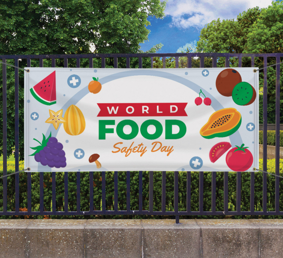
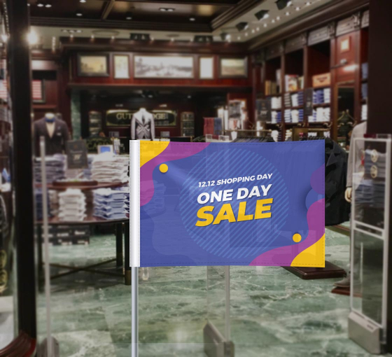
Always opt for bright colors while designing your custom banner. Studies show that bright colors help to attract more attention. If you choose a color that is pastel, it may blend in too easily with the background. Red is considered the most attractive to the human eye. It is an attention grabber and is a color that signifies power.
Yellow, on the other hand, is the most visible color to the eye. Neon colors are attention grabbers for teenagers. Through all of this decision-making, remember to choose colors that fit your brand as well as compliment the products or services you are offering.
A Special Brand of Colors
Staying true to your brand is of prime importance. Once you have a range of color choices, ask yourself which ones accentuate the brand image you are projecting in all the other areas of your business. What you put on the road may be different than what you put above your door, so it’s important to review the purpose of the sign and how it fits into your overall plan when choosing colors.
One thing to always keep consistent your logo itself. While you may choose a couple different color palettes to color your logo to give it versatility, the logo itself must always remain the same if it will have any chance of being memorable.
Don’t Make Your Banner Too Wordy
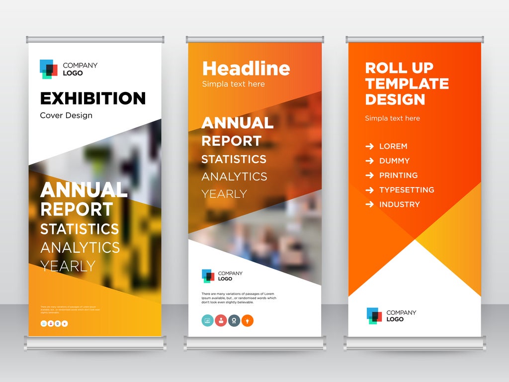
Too many words mean your core message will lose its value. You want to keep outdoor sign messaging as simple as possible so people can read it quickly. If you add multiple lines of text, people are likely only to catch a few of the words. This could spell trouble if you want your customers to read everything.
Creating Your Logo
If you opt for text alone, it won’t be as eye-catching as you want it to be. Your logo on outdoor signs is critical for every banner and sign that you make for your small business. Your logo should capture your brand’s story in a metaphorical way, much like the Golden Arches of McDonald’s or the swoosh of Nike. Yours could be as simple as a star or shape as long as it represents the story of who you are as a business.
Know the Material

Mesh banners are an ideal choice for outdoor use. They are extremely durable and can withstand harsh weather conditions with ease. With tough edging and strategic air holes that ensure it stays put, even in extremely windy areas, these banners are great for everything from hanging banners to fencing. You can also opt for the shade cloth fence or the vinyl materials that are equally strong and great for outdoor advertising.
Be Everything that Meets the Eye – and More
When you’re creating outdoor signs for your small business, it’s important to create ones that are eye-catching. If you can get people to see your sign from far away and get interested in your business, it means you have created a successful banner.
In the end, there are many ways to create outdoor signs that will get people’s attention. Take the time to strategize what you want your sign to be used for. You can then incorporate the various tips so that the sign is capable of attracting the attention you want.
Resources:
6 Tips to Create Eye-Catching Outdoor Signs for Small Business
https://www.designquote.net/wp/6-tips-create-eye-catching-outdoor-signs-small-business/
 Posted in