How Retailers Can Use Signage to Boost Easter Shopping This Spring
April 14, 2025
Think about the last yard sign you actually noticed. Chances are that you did not stop reading a paragraph of text. You probably caught a bold headline, recognized what it was about, and understood the message in a few seconds. That’s exactly what a good yard sign should do.
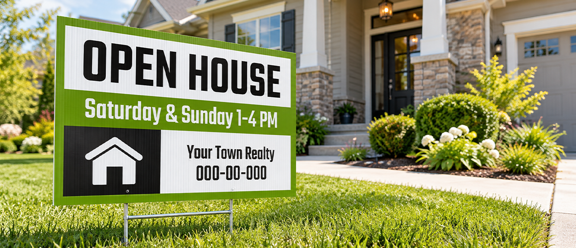
Whether it’s promoting a business, pointing people toward an event, or advertising a property, the design needs to work at a glance. Font, color, spacing, and message all play a part.
This guide covers how to design a yard sign, with 10 practical yard sign design tips on layout, font, and color choices that help it get noticed and understood fast.
Start with the one thing you want people to know. Don’t try to cram your entire offer, company story, or full-service list.
Before designing, ask:
What is the main message?
Who needs to see it?
What should they do next?
How much time will they have to read it?
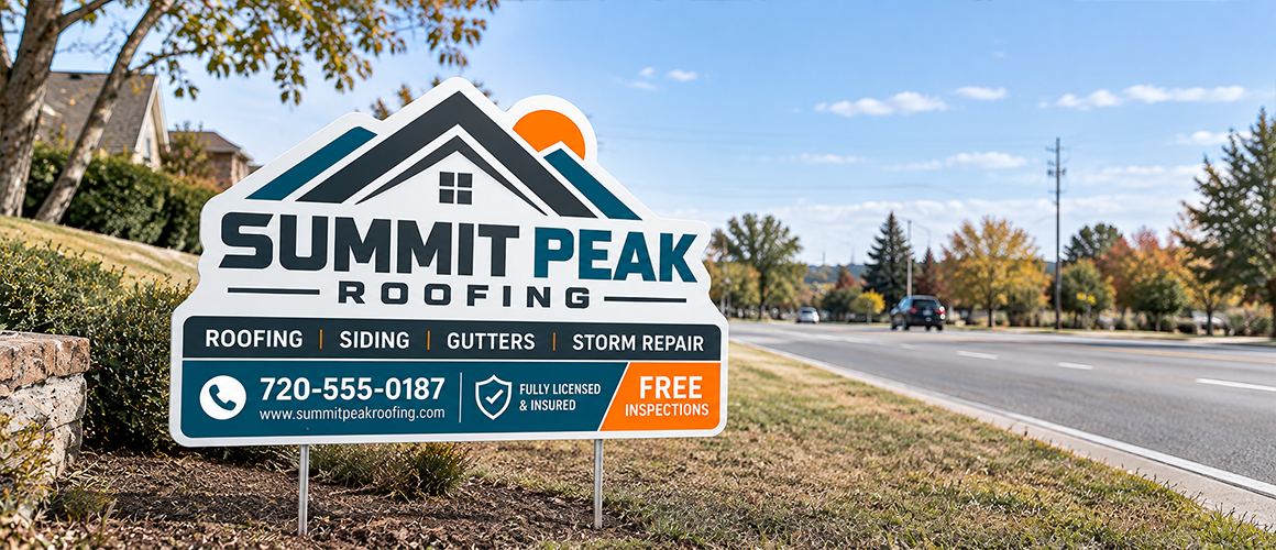
A local service business might lead with the service and a phone number. An event might just need a name, date, and location. A property listing could be as simple as “For Sale” and contact details. That’s the foundation of good yard sign design. Once the primary message is clear, cut whatever doesn’t support it.
Less text usually means faster communication. People see outdoor signs while walking or driving past, so dense paragraphs rarely get read.
| Information | Priority |
| Main Message | Highest |
| Business Name | High |
| Call-To-Action | High |
| Phone or URL | Medium |
| Supporting Details | Low |
If the message needs several sentences to explain, send people to a website instead. This is where business yard signs earn their keep: they’re built for quick awareness and a fast response, not a full pitch.
Pick type that holds up at a distance. Decorative fonts look great on screen and fall apart outdoors. Look for clear letter shapes, strong contrast, and spacing that doesn’t crowd the message. A good yard sign font also stays consistent in capitalization and weight, so it doesn’t fade out from far away.
Sans-serif faces tend to work well for outdoor yard signs because their simple shapes hold up at different distances. And keep it to one, maybe two fonts.
More colors won’t make a sign stand out. Contrast will. Dark text on a light background, or the reverse, keeps the message easy to spot. Good yard sign colors also account for what’s around the sign, whether it sits in direct sun, and your existing brand palette.
A sign planted next to a green lawn, for example, may need a background that actually separates it from the grass behind it.
A clear yard sign layout leads the eye in order, with the biggest element carrying the most important message. Something like this works:
MAIN MESSAGE
Business name
Short supporting message
CALL TO ACTION
Phone number or website
Give each part room. Packing in every inch usually makes a sign harder to scan, not easier. Working through yard sign design ideas? Sketch the hierarchy on paper before you open any software. If it’s not clear in a rough sketch, graphics won’t save it later.
Distance shapes every decision here. A sign that looks sharp from two feet away can be unreadable from across a parking lot. Think about how far people will be, whether they’re moving, what’s behind the sign, and whether it needs to work after dark too. All of this affects yard sign visibility directly. Step back from your screen, or shrink the design down, and check whether the message still lands right away.
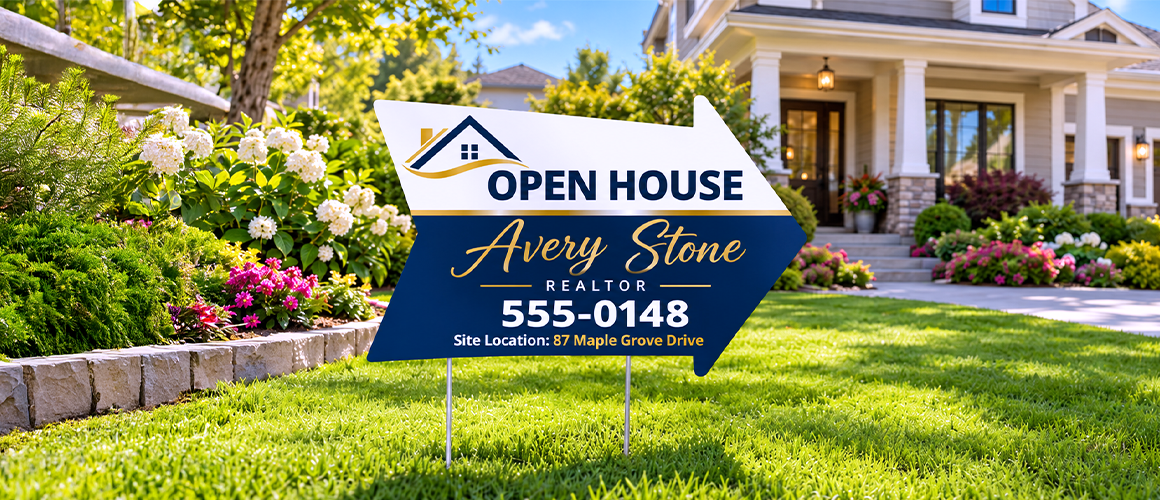
Graphics should back up the message, not steal attention from it. A simple icon, arrow, or recognizable image usually does the job better than a detailed photo, which tends to lose its punch from a distance.
A few solid yard sign ideas: a directional arrow, a service icon, an event symbol, a product image, or one graphic that reinforces the core message. Not sure if something is working? Pull it out and see if the sign gets easier to read without it.
It comes down to message, hierarchy, contrast, and simplicity, shaped around wherever the sign will actually sit. A contractor near a finished project might lead with the company name and phone number.
A community event probably needs the date, and directions front and center instead. Effective yard sign design fits the purpose. It doesn’t chase a generic template.
Good design can still fall apart if the file isn’t ready for production. Before sending artwork off for yard sign printing, confirm the final dimensions, keep text clear of the edges, use high-resolution images, check spelling and contact info twice, and review your colors.
Make sure the file matches what the printer actually needs. Material counts too. Outdoor yard signs need finishes that can take on weather and sun without fading. And if you’re running several promotions, a consistent template will save you time later.
A sign should give people a reason to remember the business, event, or offer after they’ve already driven past it. Good yard sign advertising pairs visibility with a simple action, something like:
GRAND OPENING
Visit Us Today
123-456-7890
Nobody needs every detail. They just need enough to recognize the offer and know what to do next. With promotional yard signs, keep the promotion front and center. If you’re sending people somewhere, make the direction obvious.
Before you print, run through a quick check:
Readable yard signs get a second look, and running through these yard sign tips first catch problems before they hit production.
Once the design is ready, turn it into custom yard signs sized and printed for whatever location, campaign, or event you need them for. Need more than yard signage? A wider range of custom signs can keep your look consistent across storefronts, events, and anywhere else customers see your brand.
The most visible signs aren’t the ones packed with text, graphics, or color. They’re the ones that get the message across fastest. Keep it short. Use the readable type. Build real contrasts. Give key elements room to breathe. Think about where the sign will actually be seen, and how fast people will pass it. Design for how it looks in the real world, not just on your monitor, and a simple outdoor sign turns into a marketing tool that actually pulls its weight.
If you have ever seen a graphic rise from a slim floor base at a trade show, store or reception…
Choosing the right window decals for your store or office depends on your primary goal, whether that means boosting storefront…
Outdoor vinyl stickers are an excellent choice for durability and aesthetics, but many users face the challenge of maintaining their…
Yard signs are a cost-effective and versatile way to get your message across whether you're promoting a local event, supporting…
Have you ever printed a banner, poster, or sign and found that the image looked blurry or pixelated? This happens…
Choosing the right canopy tent size is about more than finding a tent that fits your event space. You also…