


Think back to the rain-slicked streets of Blade Runner, the buzzing pink aura of a 1980s Miami vice den, or the iconic “Cocktails & Dreams” sign from Tom Cruise’s Cocktail. Pop culture has spent decades conditioning us to associate neon with a specific kind of magic. It’s the visual shorthand for “cool.” Whether it’s the futuristic cyberpunk aesthetic of Cyberpunk 2077 or the cozy, indie-vibe of a Netflix coming-of-age montage, neon is the pulse of the scene. But here’s the thing: Joe’s Diner doesn’t look like a high-tech dystopia by accident. It looks that way because someone spent a lot of time obsessing over the best fonts for neon signs.
When you decide to commission a custom neon sign, you aren’t just buying a lamp. You’re building an atmosphere. You’re creating a “main character moment” for your bedroom, your business, or your streaming setup. But nothing ruins the vibe faster than a font that looks like a default Microsoft Word preset from 1997. Choosing neon sign fonts is an art form that sits at the intersection of physics and design. If you’ve ever wondered how to choose fonts for neon signs, you’ve come to the right place. Let’s break down the glow.
Popular Products


The Physics of the Flex: Why Font Choice Matters
In the old days, neon was all about artisan glass blowers bending tubes over fires. Today, LED neon signs have revolutionized the game, making custom decor accessible and durable. However, even with flexible LED technology, you are still working with a physical material that has a thickness. Unlike a printed logo, where lines can be hair-thin, fonts for neon signs need to account for the “tube width.”
If you choose a font that is too cramped, the letters will bleed into each other once you hit the power switch. The “O” becomes a solid circle, and the “M” looks like a glowing blob. This is why simplicity is often your best friend when designing a custom neon sign font.
Pro Tip: Always look at the “kerning” (the space between letters). For neon, you want a little more breathing room than you would use on a business card.
Matching the Font to the Vibe
Just like a movie soundtrack, your font sets the tone. Different industries and spaces require different typographic personalities. Let’s look at how to pick the right style for your specific needs.
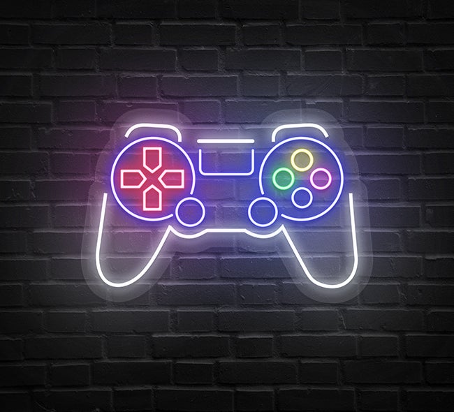
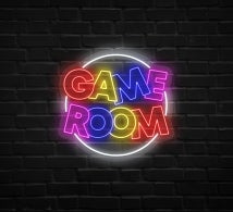
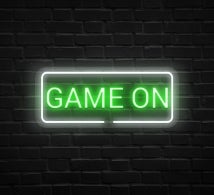
The Digital Arena: Gamers Neon Signs
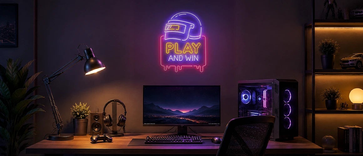
For the Twitch streamers and the e-sports enthusiasts, gamers neon signs are a rite of passage. Here, you want fonts that feel “techy” or high-energy. Geometric sans-serifs or “glitch” style fonts work perfectly. Think of the sharp, angular letters seen in titles like Halo or Apex Legends. These fonts pop against dark backgrounds and look incredible in RGB color schemes.
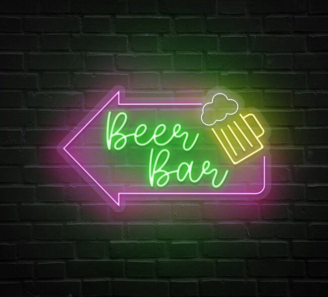
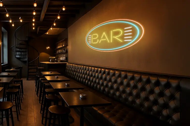
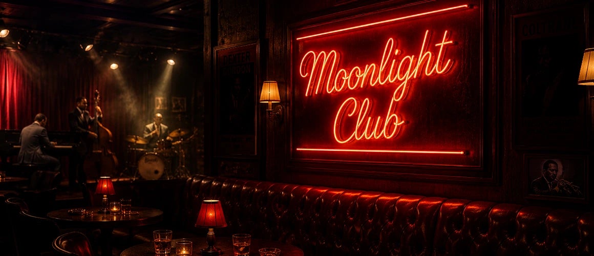
The Social Hub: Bar Neon Signs
Bar neon signs are often the focal point of a room. You want something bold that can be read through a hazy, crowded room. Blocky, all-caps fonts are the gold standard here. They give off a classic Americana vibe; think of the beer signs hanging in your favorite local haunt. Double-line fonts (where the letter is an outline) are also a fantastic choice for bars because they add depth and a vintage feel.
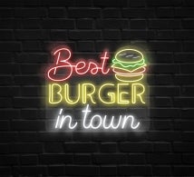
The Culinary Experience: Restaurant Neon Signs
When it comes to restaurant neon signs, the font should reflect the menu. A burger joint might go for a chunky, friendly “bubble” font that feels approachable and fun. A high-end Italian bistro, however, might opt for a sophisticated, thin serif font that whispers class. Remember, a restaurant sign is often a photo-op for Instagram, so the font needs to be photogenic and clear.
The Aesthetic Oasis: Beauty & Salon Neon Signs
For beauty & salon neon signs, it’s all about the “cursive flow.” Script fonts that look like elegant handwriting are incredibly popular. They suggest grace, fluidity and personal touch. However, script can be tricky in neon. You need to ensure the loops are large enough that the LED material can actually make the turn without looking messy.
Top 3 Rules for Choosing Custom Neon Sign Fonts
- Rule 1: Mind the Monoline. The most successful neon signs use “monoline” fonts; where every part of the letter is the same thickness. This ensures a consistent glow from start to finish.
- Rule 2: Script vs. Print. If you choose a script, make sure it’s a “connected” script. Since custom neon signs are often made from one continuous piece of LED flex, connected letters make the manufacturing process cleaner and the final look more authentic to traditional neon.
- Rule 3: Test the Scale. A font that looks great on a 40-inch sign might be unreadable on a 12-inch sign. If you’re going small, go simple. Save the flourishes for the big statement pieces.
Color and Legibility
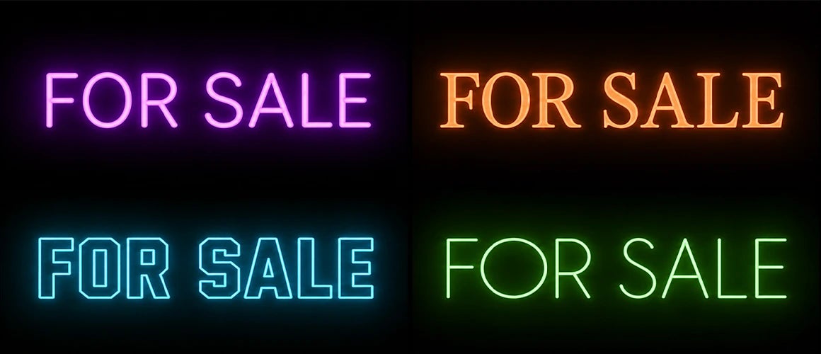
It’s not just about the shape; it’s about the light. Bright white and yellow neon tend to “expand” more visually than darker colors like deep blue or purple. If you are using a very bold font in a bright white, it might become too bright to read. When learning how to choose fonts for neon signs, consider the brightness of the room. A dimmer room allows for more intricate fonts, while a bright storefront needs bold, clear lettering to compete with the sun.
Why Custom is Always Better
Off-the-shelf signs are fine, but they lack soul. When you invest in custom neon signs, you are putting your personal stamp on a space. Whether it’s your favorite movie quote, your gamer tag, or your brand’s logo, the typography is what bridges the gap between a light fixture and a piece of identity. By picking the best fonts for neon signs, you’re ensuring that your vision isn’t just seen; it’s felt.
Conclusion
Next time you’re browsing through thousands of neon sign fonts, don’t just pick what’s trendy. Pick what tells your story. Are you a Stranger Things retro-80s fan? Go for the ITC Benguiat. Are you more of a Great Gatsby Art Deco enthusiast? Find a sleek, high-contrast serif. Your font is your voice, so make sure it glows loud and clear.
Don’t settle for the generic. Take your time, experiment with different neon sign fonts and consult with creators who understand how light behaves. Your space deserves that cinematic, pop-culture-worthy glow. Now, go ahead; pick a font that shines as bright as your ideas, and let your custom creation do the talking.