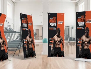


A single banner can shift someone’s attention in a split second. You might be walking through a busy street or looking around a crowded event when one clear message, paired with the right colors, suddenly stands out from everything else around it. That’s why businesses around the world rely on vinyl banners when they want their message to reach people quickly and without strain.
Knowing how to design vinyl banners helps you shape layouts that speak clearly even in noisy, fast-moving spaces. A good banner does not try too hard. It guides the eye gently, uses space wisely, and shares information in a way that feels natural to read.
This blog includes a helpful set of ideas that show you how to build designs that feel calm, readable, and purposeful, no matter where the banner is displayed.
Choose a clear message that people can understand quickly
A banner works best when it can share a message within seconds. Many people pass by without slowing down, so the content must be simple enough to grasp at a glance. Begin by deciding on the main point you want people to notice first. This could be an offer, an event date, or a short welcome line.
Once you know your point, build the rest of the layout around it. A short headline placed at the top or in the center usually works well because the eye naturally moves to these areas. Keeping the headline clean helps.
When exploring vinyl banner ideas for business, think of how a viewer will read the message while walking or moving in a car. If the words feel crowded or confusing, remove what is not needed. A simple message always travels farther.
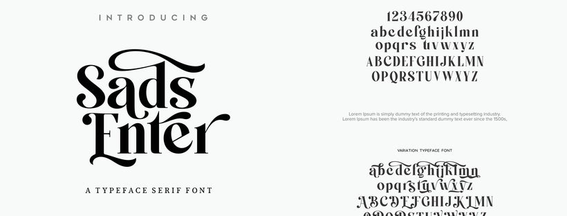
Use readable fonts that stay clear from a distance
Font choice has a huge impact on how easily people read a banner. Thick, clean fonts tend to stay sharp when printed large, while thin or decorative styles can lose clarity. Pick a font that matches the mood of your message while staying easy to follow.
Most banners use one strong font for the headline and a simpler one for smaller details. If you combine two fonts, make sure they do not fight for attention. It also helps to check how the letters look when scaled up, because some styles distort larger sizes.
The right font creates a smooth reading path, especially if you are creating a DIY vinyl banner and want to keep things simple but professional. Good spacing between letters and lines also prevents the text from blending together. A readable font improves visual comfort and message delivery.
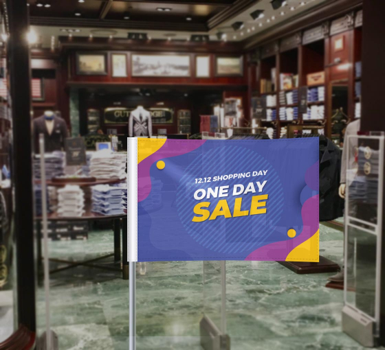
Use Colors that Create Contrast and Match Your Banner’s Purpose
Color plays a large role in attracting attention. A strong contrast between background and text, for example light text on a dark surface or dark text on a light one, keeps the information clear and readable from a distance.
Limit your banner to just a few colors, ideally two or three, to prevent the design from looking crowded. A well-chosen palette guides the viewer’s attention through the text naturally. If you’re advertising a sale or an event, using bold, bright colors can draw more attention. If it is meant for a formal setting, calm tones might be more suitable.
For promotional success, you need to learn how to make vinyl banners stand out without overwhelming the design. Know that the goal is to create interest without clutter. Test a few combinations on screen before moving forward. Good color choices make a banner noticeable and easy to read.
Use High Quality Images and Thoughtful Placement

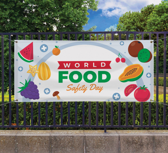
Images can support the message when used carefully. A clear, sharp picture adds visual interest and can explain something faster than words. But the images should have a purpose. If a photo does not relate to the message directly, it may distract the viewer.
Choose simple graphics, icons, or photos that reinforce your main point. Make sure they are high resolution, so they stay crisp when printed large. Place them in areas that do not clash with the text. Many people forget that images should guide the viewer, not compete with the words.
When planning to design vinyl banners, ensure every visual has a function. Give the image enough space so it does not feel squeezed. A well-placed picture helps the viewer move smoothly from headline to details.
Leave Enough White Space to Keep the Layout Comfortable
White space, or empty space, is one of the most valuable parts of good design. It prevents the banner from feeling cluttered and gives each element room to breathe. Many people try to fill every corner with text or images, but that overwhelms the viewer. White space helps the important details stand out naturally. It also makes the banner look calm and organized.
This is one of the most important vinyl banner design tips that not only improves readability but also makes your banner look neat and attractive. Think of the banner as a path the eye must follow. If the viewer feels crowded, they may skip the message entirely. When the layout includes enough empty areas, the message flows smoothly from start to finish.
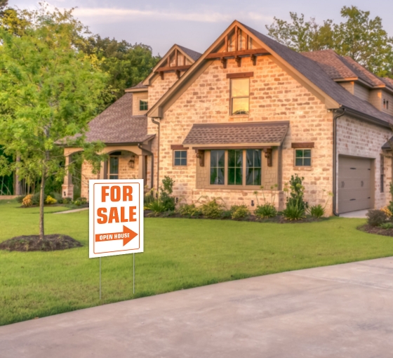
Plan the Size of the Banner According to its Placement
Where the banner will hang should always guide your design decisions. A banner displayed outdoors needs larger text and bold colors because people view it from farther away. A banner inside a shop or event space can use smaller text and softer tones.
When creating your custom vinyl banners, check the distance from which people will see it and adjust the letter size based on that. If the banner hangs high, place the key message toward the upper center, so viewers do not have to search for it. The setting affects color, size, layout, and even image choice. When you understand your environment, your banner communicates more effectively.
Create Structure with Hierarchy and Careful Flow of Information
Hierarchy means arranging text and images by importance. This helps guide the viewer from the most important details to the supporting ones. Start with a clear headline, then share secondary information such as dates, descriptions, or contact details. Break long lines into shorter phrases so they read smoothly.
Shapes, icons, or simple boxes can also help highlight small but important points. A thoughtful structure is especially helpful when designing custom banners, since it lets you control how the viewer reads the message. When the flow is natural, the banner feels easy to follow and pleasant to look at. A clear structure also improves retention, which means people remember the message longer.
Design Keeping in Mind the Audience and the Purpose

And lastly, when designing any element of your banner, keep in mind the purpose and audience that is going to read it. Every banner has a different audience. A design for a school event will feel different from the layout for a shop opening. Before you start designing, think about who will read the banner and what they need to know quickly.
The colors, images, and tone should match the viewers’ expectations. A well-planned design supports your business banners, where clarity and trust are important. When the design respects the viewer’s needs, the message feels more natural and more likely to be read.
Conclusion
A strong banner design is built on simple choices that work together. Clear text, thoughtful spacing, balanced colors, and the right images can help your message reach people with ease. When you understand how the viewer reads and what they notice first, your layout becomes more natural and effective. These ideas make it easier to create banners that look clean, share information quickly and fit the space where they are displayed. With patience and smart planning, you can create a banner that communicates clearly and draws the right kind of attention.
Written By Best Of Signs Editorial Team!
 Posted in